Here is my latest and greatest...Faces of Sue. This LO was made with the April Swirlydoos kit Bella Volo. Isn't it fantastic. I am absolutely in love with these uber romantic papers from Bo Bunny. Anyone who knows me KNOWS I am not the romatic like type...but I'm growing. My goal for this month is to complete 3-4 layouts and to blog at least once a week. Here's to the start of a great month.
Here is a closeup of some more hinges that I made. Also you can see where I wrapped the crystals branches around to fasten them.
This is a closeup of a rosette that I made. My belly dance instructor had a giant bag of tiny silk scraps from her sewing of veils and skirts. Most of them are less than an inch wide. I have been dying to use them but had no idea how to use them for so long. I am so excited. I may even begin to make multi colored rosettes. OOOOOO....hmmmmm.....

Can anyone say Martha Stewart deep edge punch?! OMG I love this thing. Originally I had used a paper bleaching technique with this word stamp on the edges but I was a punching re re and it looked awful. I didn't get anything to line up right. I didn't feel like turning on the iron and doing the paper bleaching all over again when opaque Staz on ink would give the same type of feel. I also sprayed the edge with Tattered Angels glimmer mist in the color coffee. It's very beautiful up close but doesn't come through on the picture real well. Also, getting better with the water distressing technique. Although you have to let go and let it form on it's own, you also can kind of control what the outcome looks like if you have a general idea. I'm getting to the point where I can first have a plan with it and that's just got me all kinds of happy. If you haven't tried it, check out the tutorial on Swirlydoos and give it a go. You may be pleasantly surprised with what you come up with.

This pic shows so much. The swirly chip board underneath is by Mya Road. I didn't have the right color peach so I mixed a peach and pink together to make it a tad more salmon. The color was perfect. I then used about 6 layers of UTEE(ultra thick embossing enamel) to give it the shiny raised texture. I tried to crackle it but apparently I would have had to add more because it just bent and flexed all over the place. It looked just a little to bright so I grunged it up a bit with some Tim Holtz distress ink in antique linen. The green butterfly is done with liquid glass, some black stickles on the black areas and cut pearls from a long thread out of the dollar bin at Joann's. I have about 8 yards of these little pearls on a strand. It's great because you can cut them to use individually (as you see here) or keep the strand as a whole (which is coming soon. I had a fabulous epiphany this week and then topped it off with another last night for a future layout...coming soon)

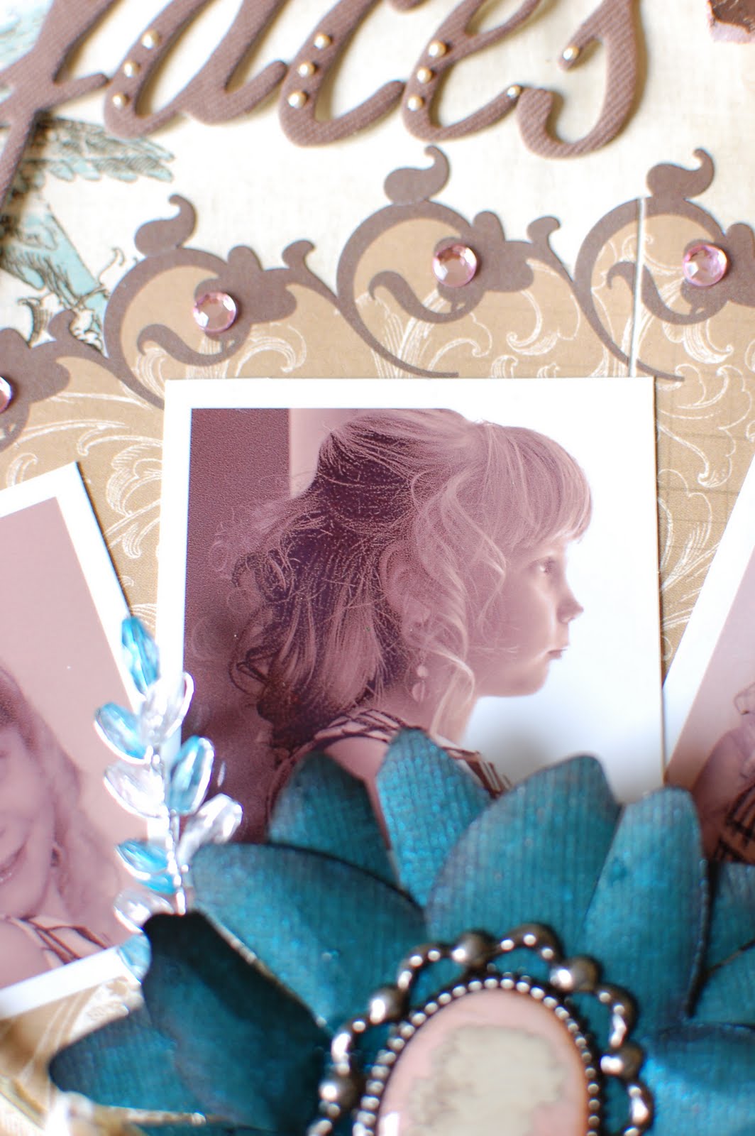
The letters were included with this month's kit. They just felt so plain. The paint is Ranger Liquid Pearls in Bisque. It really dressed up the letters and made them that much more romantic.
This is my favorite picture from this series. It's also a close up of the flower. The flower is actually from the Pagoda Cricut cartridge. It's a spiky 5 petal flower. I cut the petals apart and then cut them in half. I rolled them and inked the edges with dark brown pigment ink. I then sprayed the flower with TA glimmer mist in patina. For a tutorial on the flower you can head over to Swirlydoos. Yeah, I totally stole that technique;)
Last I just wanted to showcase the liquid pearls on the peach butterfly. If this photo makes you swimmy in the head it's because I too the photo sideways to get the right lighting on the butterfly and then rotated the photo in the computer. Sorry. I love this close up because you get a little bit of all the page elements all at once.
Personally I am mimicking the techniques and layouts at Swirlydoos in order to incorporate them into my own style. Since this is only my second layout it is still very Swirlydoos and not a whole lot of Scrappygoddess. The only way I can learn and be effective is through critique. Please feel free to leave comments about what you like, what you don't like, and what you think needs to be done differently. Any and all help is greatly appreciated. Thanks for looking.


Ok so here is some critic. I'm not a scrap booker so if I'm just wrong tell me. I think the colors and page is beautiful. I had a problem reading faces of Sue. I think there is too much separating faces and of sue. Maybe put them all together and fill blank space with another rosette or butterfly? Sorry, designer in me won't shut up about the lettering. I love the page in general though and those are great pictures of Aubrey :) I think you need to be a photographer as well to be a good scrap booker and you do both well!
ReplyDeleteBeautiful! I love how you layer thing so beautifully. I can never get that technique down pat and I just love it. I'm also glad you blogged about how you attached the crystal branches. We had those in an older kit and I had a really hard time getting them to stay in place. Guess I was just brain dead by not coming up with your simple solution.
ReplyDeleteGreat job - love your pages!
Finally stopping by...sorry...it too so long! Gorgeous layout..LOVE the photos...that is one precious cute little beauty! So jealous...just boys here (so hard to scrap "Beautiful" and "boy"..they just don't like it. Love your layering and punch work..and of course the embellies! Beautiful page! Hugs!
ReplyDeleteBTW...I just love your profile picture! So fun...everytime I see it at Swirlydoos....I think ...that girl knows how to have fun! Hugs!
ReplyDelete